Typography is a huge deal - if you don't believe me check out Hoefler & Frere-Jones. You can purchase four font packages for only $499.00! What a steal. Holy crap when did letters get so expensive? Ever since they started looking so good, I guess.
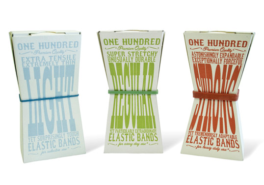
“The brief was to go into the pound shop and pick out something that seemed dull and completely re think the packaging of it. The idea is that the elastic band in the middle squeezes in the box and the strong the band, the most the box is squeezed.”
I think that the typography used on the packaging of these boxes of elastic bands is extremely effective. It takes a boring idea of packaging elastic bands, which frankly I can't even think what that packaging would even look like, and made it interesting. The amount the box is squeezed in directly relates to how strong the elastic bands are, and the typography for each box gets more stretched as well. It's a very fun design that sticks to one colour and bold vintage style serifed fonts. Everyone needs elastic bands at some point, but the typography here is clearly aimed at a younger demographic that would choose something for its design rather than purpose.
The concept is clever because the type of elastic band is advertised in the middle, and that is the word that is getting stretched to varying degrees. It is also a very clean design with all the words ending at the same points, and the different fonts are similar enough that they add variety but still look like they are a part of the same family. I would buy this product.
Designed by Ric Bixter


Designed by Ric Bixter
"The new label maintains a balance of filigree, iconography, and special typographic elements, in black and white with a touch of silver."
I'm a huge fan of typography associated with various kinds of alcohol - I think that it's incredibly classy and this redesigned Jack Daniels liquor label is no excuse. (It's a layed out version of what would regularly be wrapped around the bottle, click on the caption to get other views) The Jack Daniel's font is bold and recognizable and working with white against black for the centre of the bottle, frames against two sides with raised stripes. The typography coupled with the shape of the bottle achieves a distinctly chiseled and masculine feel and is absolutely perfect in representing the drink 140 years after its begining.
By Behance Network
By Behance Network
Unlike most of the typography that I usually post which is print based (I'm a sucker for anything print), this struck me as very witty and interesting as well. To be fair it is also technically 'print' but it is an ad that is featured outdoors in Australia. I love that typography was used non-traditionally here, in that fon't were carved out of the ice to make the words for the ad.
The ad is clever, has great coloring, and conveys the message very well to its audience. My only complain would be that I think this particular version of the ad (there are a few others as well) has a bit too much head room at the top. That's just my personal opinion though, and I am by no means a professional designer.
By Clemenger BBDO
By Clemenger BBDO
No comments:
Post a Comment