9/29/11

Lovely Package | Curating the Very Best Packaging Design


Packaging matters. A lot. Especially when it comes to food. 


I know that I'd much rather glide into a Pusateri's to browse their selection of aged balsamic vinaigrette than do my usual shuffle through No Frills and pick up the cheapest No Name brand, with a yellow that might as well be screaming 'deer crossing ahead'. I like picking up a jar of relish and seeing how every single word must have taken hours to place, the font carefully chosen and the colours adjusted just right - so that the company could justify asking $29.99 for 15 fl. oz. 


Everyone falls into the trap though, and if it weren't such an expensive one I wouldn't call it a trap - because good packaging is something that I think should be a lot more abundant. Is it so much to ask that Helvetica font be used instead of Comic Sans? I don't understand how Comic Sans still has a market. 


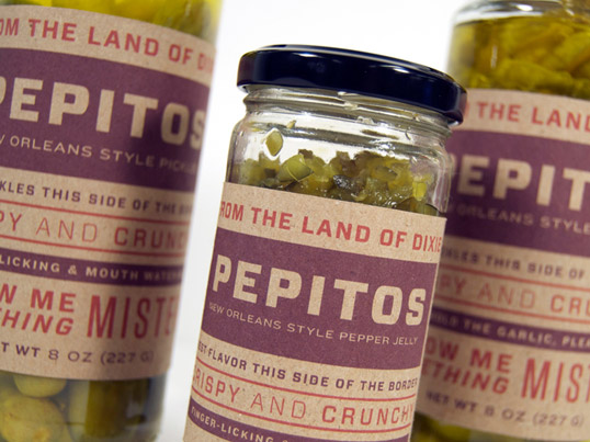
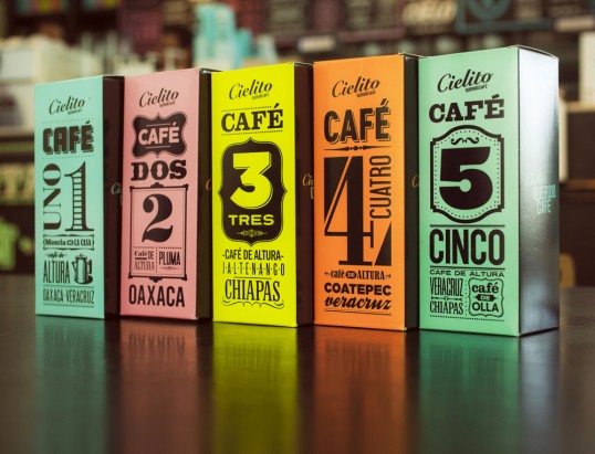
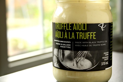
Websites like Lovely Package showcase the very best in packaging design, and I spend hours browsing through pictures of products that I may never even be able to afford. Eye candy for those of us who are forced to buy President's Choice (although they recently launched a high end Black Label line of products that resemble Pusateri's designs very much).


Good food packaging makes me feel okay about eating certain things, and more often than not if a company has spent the extra buck on packaging you know that their product has probably had more time put into it as well. We all know that isn't always the case - Stabucks for instance - but their coffee is arguably still tastier than Tim Hortons, and their packaging design is crisper. Direct correlation? I'd like to think so. 


It frustrates me that good design isn't more abundant. There are so many resources out in there  in the world, not even the physical world, Google. There are even websites devoted to breaking down the fonts used for various products. A common trend I've recently noticed is 'no serif, no problem', and I admit I'll fallen for it as well, having recently downloaded all fifty different kinds of Helvetica. 


I guess the point of my Lovely Packaging rant is that I wish that beautiful things were more affordable, either that or great designers were hired everywhere. But I guess the reason there is such a difference between good and bad design is why we can appreciate the good anyway. I'll just continue to admire the simple delight that is nice packaging...and typography. 

9/24/11


This poster design for the movie Fear and Loathing in Las Vegas is a great example of two of the CRAP principles. Alignment and repetition are used very effectively in order to achieve a the effect of a united road. It's eye catching and due to the fluidity and continuity of the lines, it draws the eye all over the page so that the details can also be enjoyed.

The use of proximity is very effective with the placement of the title of the movie, Big Fish. It is centered, draws the eye in and is done in a very avant garde style that can instantly be recognized with the movie. What I don't particularly like about this poster, however, is the alignment of the words at the bottom and top.They don't seem to work with the 3-D title and are very randomly spaced. Maybe the designer thought that the title of the movie was fancy enough, but I would have placed the other words differently and perhaps added an inner drop shadow. 


The use of contrast in this image is incredibly effective. The viewers eyes are immediately and soley directed at the woman in the photograph. There is also a misrepresentation here, which will also intrigue the viewer. On first look you wouldn't think that this photo would be for Vick's, however once the tagline is read the Ad becomes witty and even more enjoyable.

                   
The use of repetition and alignment are effective in this vintage poster for the upcoming ABBA movie due to the name of the movie being repeated throughout the length of the poster. The designer made the repetition interesting by adding pictures of the band and varying the color, but always keeping to a color scheme so there's the poster is uniform.  I love the vintage feel and the use of black and white photos against  large colourful letters. 


9/19/11

I'm an older sister to a not-quite-so-technologically-savvy teenager who has recently begun to discover the wonder that is the internet. Unfortunately for her I refuse to be cool about the whole thing and have to make sure that 'no sketchy business is going down'. My issue - that I don't trust anyone but myself when it comes to information being distributed on the internet. My sister, and I'm sure many other people, are (in my humble opinion) much too lax about the information they distribute about themselves on the internet. I'm a member of dozens of websites like everyone but I've begun to be a bit more conservative about what I actually put on them. 

On Facebook, for instance, I have my privacy settings almost of maximum. I realize this won't keep everyone out so I simply omit other things that my friends, who aren't as crazy as me, share freely. I don't like the fact that anything I decide to put on the internet will be there - forever. This doesn't stop me from joining various information sharing websites such as twitter, tumblr, flickr, google+, etsy, and last.fm. I'm not going to cut down on my 'web experience' just because I know that certain information will be retained. 

I already knew that the Facebook was recording my every move, but I'll admit the lecture brought other websites and even daily activities to my attention. There isn't any way around using the internet, so my digital identity has been carefully constructed so that I still feel safe, but share just enough to make myself an interesting google search. Go ahead, try it for yourself. 

9/13/11

This is a Photoshop Tutorial that I completed in class - A Postcard for Las Vegas

9/12/11

Ever since I discovered the beauty of independent film making and podcasting, back in 2005, I've been fascinated with the production of various media. Four Eyed Monsters, a low budget film made by two novices (Aaron Crumley and Susan Buice) caught my eye and I was fascinated by how much raw emotion their work carried across to me. At that point in time I had never been exposed to a form of media that was reaching out to its audience other than by traditional means. They were, ingeniously, releasing podcasts that showed the progress of the movie as well as chunks of Aaron and Susan's life. The videos were never completely straightforward and left me guessing whether what I had watched was fiction or reality. They felt so homemade and always started with an introduction from both Aaron and Susan, yet they were so perfectly stylized it was like watching a super exclusive television show that only so many people knew about. I had such respect for their leap into the future and going beyond anything that had been done before that I began to think that my own love for art and design was justified and perhaps I could make a career of it.


Before then I had never produced anything on the computer apart from a few terrible PowerPoints and a Windows Movie Maker disaster. After opening my eyes to the wonders that "real people" could produce via camera and editing, I couldn't stop searching for more kinds of media. I discovered other video podcasts and various comedy groups that made "shorts" and began following them religiously. Now I'm obsessed with many graphic design artists and illustrators as well as filmmakers. Photography is another long time passion of mine and I recently invested in a Canon EOS 60D - I have never prized anything more.


My fascinatation with digital media continues to grow as it morphs into a larger entity every single year. What started with two video podcasters who were trying to reach an online audience that was not yet there has now expanded to millions of users watching and creating content worldwide. It is so important to be aware of all these changes because nobody wants to get left behind. The future is now, and it's with digital media.